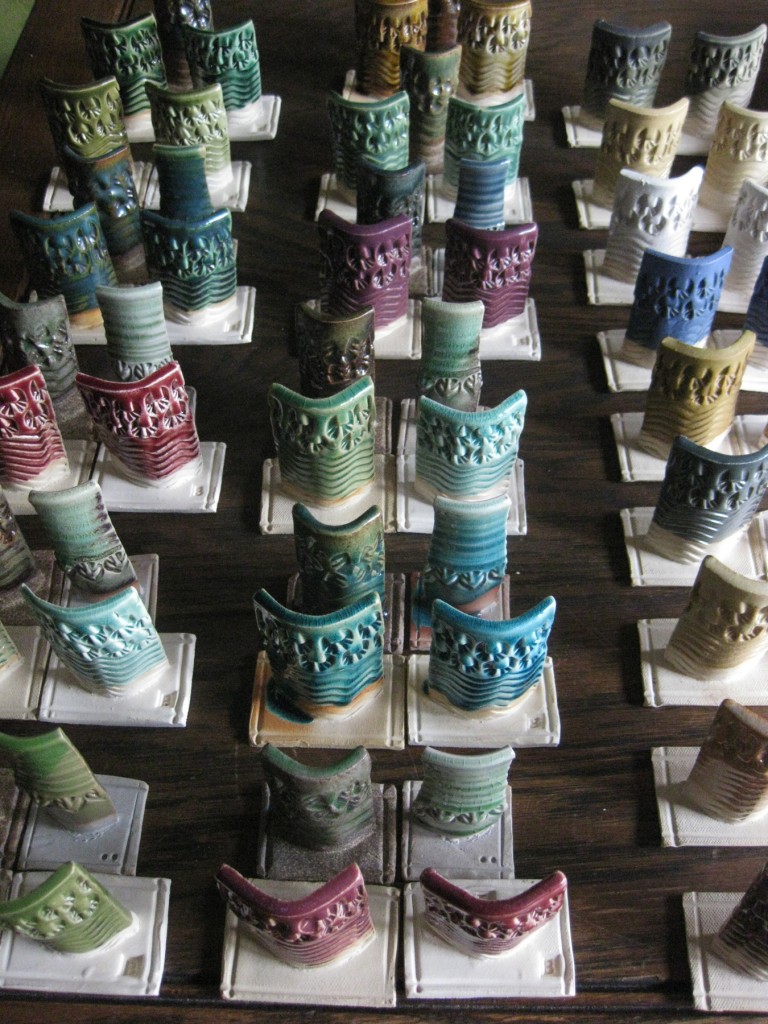
Well, it’s been a few days now that I’ve been living with these new test tiles. They’re spread out all over my dining room table and I keep looking at them. Sometimes picking them up for a closer look. Sometimes to feel the finish, the smoothness, the gloss. I finally took some time today to take pictures to share – and give them a little more critical look to see what’s really going on… and where to go from here.
So here we go. Lots of photos. Lots of tests.
Unfortunately, there are a few of them “missing” a tile. I ran out of bisqued test tiles and had to skip a few of the cone 10 tests.
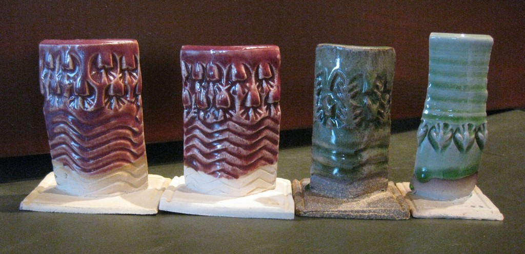
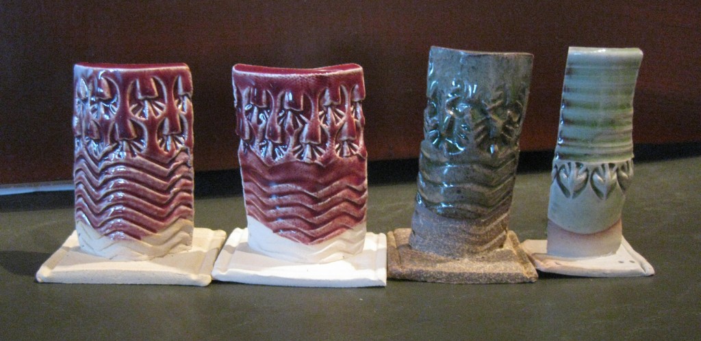
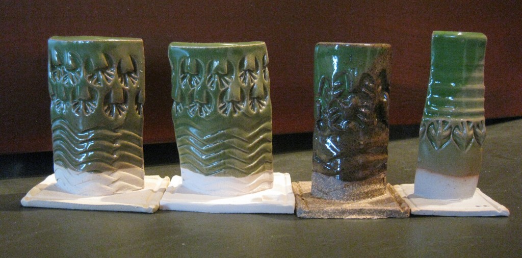
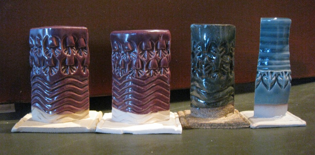
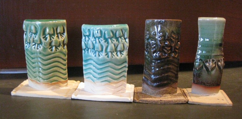
The top photo is all of the test tiles together.
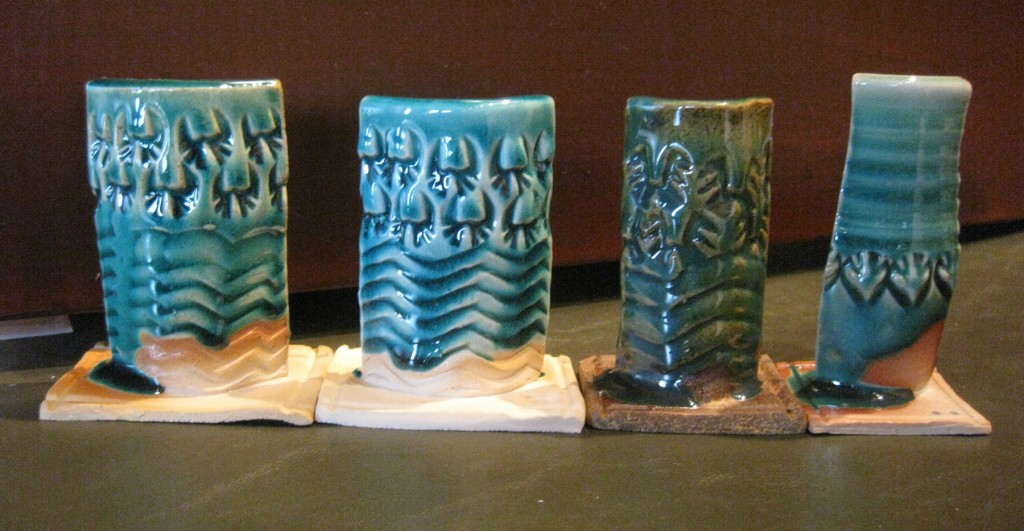
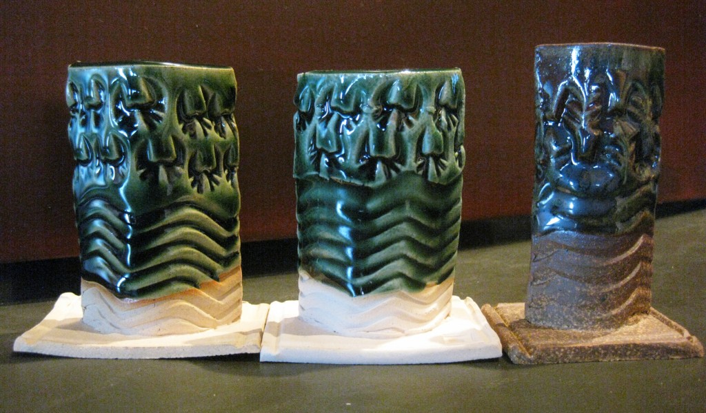
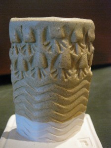
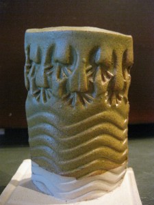
The second line of photos is cone 6 oxidation – Stoneware left, B-Clay right.
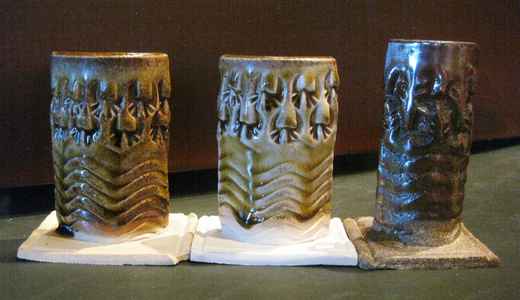
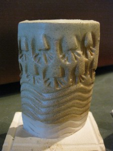
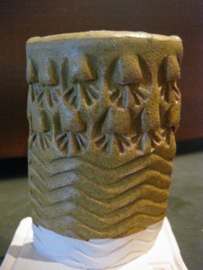
The third line of photos is cone 10 reduction – Stoneware left, B-Clay right.
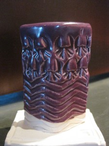
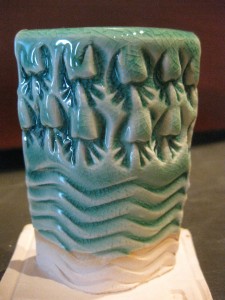
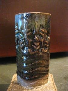
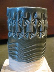
GLAZE A – This one is stunning. Maybe too much so?! Love how it puddles with a vibrant blue in the grooves & indentations. However, it still looks pretty runny & and a bit too much crazing for my liking.
GLAZE B – I’m not a huge fan of this one, the green doesn’t seem to be doing much and there’s a weird “haze” in there somewhere… plus, I think there are better greens in my tests. It is however a nice base glaze. So I might want to consider switching colorants up a bit.
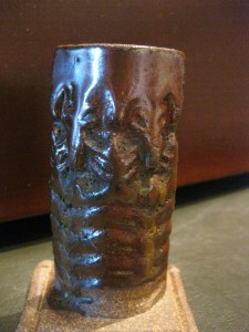
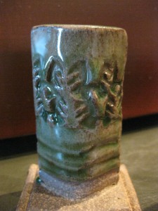
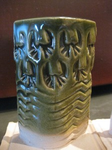
GLAZE C – A nice Oribe looking green glaze. I think it is a little too “gloppy” in places. And I’m not a huge fan of the metallic sheen.
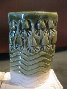
GLAZE D – Now THIS ONE is my favorite of them all!!! Love the saturated green, the pooling & breaking on textures. Doesn’t do much at cone 10… but I do think this one might be graduating up to a large bucket pretty soon for cone 6 firings!!!
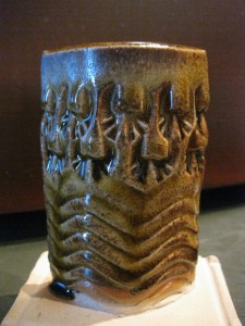
GLAZE E – A bit of a honey amber-ish temoku look. I do like it on B-Clay in cone 6, but that little drip hanging there might become a problem?
GLAZE F – While everyone is looking for a great red glaze, this isn’t it… at least not for me. Not a big fan of how “white” it breaks on the ridges. A bit to much contrast for my liking. I do like it in cone 10 on B-Clay… minus the huge crazing!
GLAZE G – Not much better. Still a little too much white-to-red-contrast for me. Although the cone 10 firing on B-Clay is still nice with less crazing?!
GLAZE H – Pretty even. Not much breaking or pooling. Looks like a pretty safe glaze for cone 6… not so good in cone 6 on stoneware.
GLAZE I – Okay, so these reds are a little better… not so much “white” where it breaks. The real kicker is how much I LOVE the cone 10 on B-Clay grayish-blueish effect. Might be worth mixing a bucket just for that?!
GLAZE J – Very similar to Glaze A – not quite so “over-the-top” dramatic. It’s a bit more subtle… and I like the “greener” on stoneware, “bluer” on B-Clay. Practically two different colors just based on the clay body.
GLAZE K – Deja vu?! Nope, you’re not seeing double. This is NOT a repeat of Glaze J. Although it does appear pretty much the same. The colors are a smidge less vibrant, but makes up for it with lass crazing. I do also like the carbon trapping effects on the cone 10 B-Clay sample.
And then I got a little tired of mixing new glaze recipe tests…
but I figured since I was already doing a test firing, I might as well do some cone 6 tests of the glazes that I already have in my studio. They’re originally cone 10 recipes… but wouldn’t it be great if they worked well at both firing temperatures?
GLAZE L – I do think this one has possibility. The finish is more matte eggshell, but it still feels nice. The colors don’t break quite as well as at cone 10, but is does have some potential
GLAZE M – Nope. Needs to go much hotter to melt in. Still kind of chalky & scratchy. Crackly in places. Not good at cone 6.
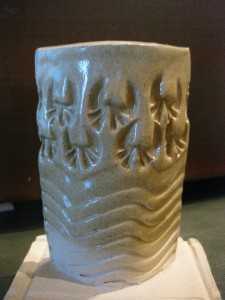
GLAZE N – Blah. Blah. Blah… Not a big fan of beige!
GLAZE O – I do think this one has potential as well. It melted fairly well and the colors pool & break pretty well on the stamps. Not a huge difference from what it looks like at cone 10, but good to know if I need to fill a cone 6 kiln and I’m looking for existing glaze buckets to dip into?!
GLAZE P – Not only does it need to go hotter than cone 6, it just kind of looks anemic.
GLAZE Q – Yuck. Feels like rough, plaster wallboard!!! Definitely a no-go!!!
GLAZE R – More beige. More blah.
GLAZE S – Pretty flat & even. Kinda looks like Dijon mustard spread all over it?!
GLAZE T – This one might do in a pinch. Looks like it melts fairly well and has a good finish. Not so sure about the color though?… what do you call it?… Linda Blair Green?
GLAZE U – Works. But not do well. Melts… but that’s about it.
So there they are so far. There are obviously a few that are NOT good at cone 6.
And a few others that have some crazing issues. Now I need to go through and spend some more time analyzing them a bit more critically. And for some of them, considering if the “base” is good and can have other colorants added.
Before the questions start about sharing these glaze recipes, I feel like I need to make sure they are all good, stable, well-firing glazes. And that I have some experience with them, tweak them a bit more, and make sure they are good glazes BEFORE I even consider sharing recipes! And I would hope that other potters would do the same – make sure it’s a good recipe BEFORE they share it with other potters… like me.



























I was waiting to see the results from your testing. I am so glad to get on your blog everynite. Once I retired I taught myself to throw, now I’m teaching myself to make my own glaze. This is the 1st time I am able to see that the same glaze produces different colors on different clay,or the difference in the firing.
Thanks for teaching me about pottery on line!!
Thanks for sharing, Gary! I’m looking forward to the day I can start mixing my own glazes. 🙂