04.30.2026
Categories: color, surface decoration
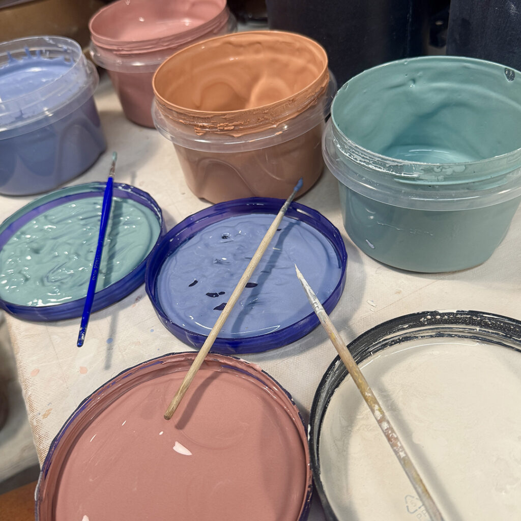
Adding a swirl of color! Okay, so I can’t stop myself with just a swirl. So I did cover the entire flared flange area of the plates with a full, smooth layer of colored slip. Some green, some blue, some red & some black! Looking forward to some fun carving & sgraffito!!!